Common AI Book Cover Mistakes to Avoid for Authors
Common AI book cover mistakes to avoid
Estimated reading time: 11 minutes
- The most damaging AI book cover mistakes are generic art, poor typography, and misaligned genre signals — fix those first.
- Treat AI as a rapid draft tool, then apply design judgment: simplify the concept, prioritize readable type, and check technical specs.
- Use integrated tools that combine cover generation with formatting and EPUB support to reduce production errors and speed publishing.
Table of Contents
- Why AI book covers go wrong
- Six common AI book cover mistakes to avoid
- Generic or obviously-AI artwork
- Amateur typography and hierarchy errors
- Cluttered layouts and mixed visual messages
- Misaligned genre signaling
- Technical and production errors
- Legal and provenance risks
- A practical checklist to fix AI cover mistakes
- How BookAutoAI helps prevent these mistakes
- Cover quality and market fit
- Built-in formatting and EPUB support
- Humanization and editorial quality
- Workflow advantages for self-publishers
- Practical example
- Final thoughts
- FAQ
- Sources
Why AI book covers go wrong
Common AI book cover mistakes to avoid is a phrase every self-publisher should read carefully before they hit upload. AI tools generate images fast, but speed without discipline creates predictable failures.
At thumbnail size a cover must read instantly. Readers judge books in seconds. When covers look generic, have weak typography, or send the wrong genre signals, click-through and sales suffer.
AI is powerful for exploring visual ideas, but the technology often produces outputs that feel “off”—slightly distorted details, odd proportions, or backgrounds that don’t match the tone of the book. Many authors accept the first attractive image the model produces and paste it under default fonts. That shortcut produces covers that scream “DIY” even when the art looks interesting on its own.
If you want curated examples and a sense of what professional, market-tested covers look like, check our Top 10 Book Cover Generator for comparison and inspiration, and for hands-on cover tools see our book cover generator processing guide.
Understanding why AI covers fail helps you avoid the worst mistakes. There are five patterns that repeat across genres: obviously-AI art, poor typography, cluttered composition, technical production errors, and genre mismatch. Fixing those areas raises perceived quality dramatically.
Six common AI book cover mistakes to avoid
1) Generic or obviously-AI artwork
Why it hurts
AI generators tend to reproduce similar visual motifs and textures that become recognizable as “AI-made.” The result is covers that look formulaic or uncanny. Readers pick up on subtle cues—slightly odd faces, awkward hands, or unrealistic lighting—and mentally discount the book.
How to avoid it
Use AI for concepts, not final art. Generate multiple variations and choose elements to composite. Replace problematic faces or hands with licensed stock or a simple graphic motif. Aim for a clear, single visual idea rather than a busy scene. If the art still feels synthetic, use texture overlays, photographic elements, or hand-retouching to humanize it.
2) Amateur typography and hierarchy errors
Why it hurts
Typography is how your title sells. Weak font choices, poor spacing, and bad contrast kill readability at thumbnail size. Even great imagery can’t save a cover where the title gets lost or looks unprofessional.
How to avoid it
Adopt a “typography-first” mindset. Start by placing the title, subtitle, and author name in your layout before finalizing art. Choose fonts that match the genre and set a clear hierarchy: title largest, subtitle smaller, author readable. Avoid decorative fonts for the main title and test legibility at 100–200px width to simulate store thumbnails.
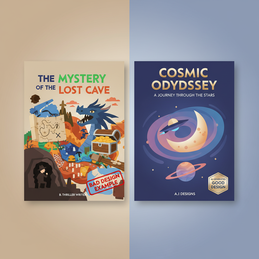
3) Cluttered layouts and mixed visual messages
Why it hurts
Covers that try to say too many things confuse the reader. Multiple focal points, competing color stories, or too many effects (glows, bevels, multiple overlays) make the cover noisy and unreadable at small sizes.
How to avoid it
Limit the cover to one primary visual concept and one strong typographic statement. Use negative space or a simple background to keep type legible. Remove unnecessary props or secondary elements unless they reinforce the main idea.
4) Misaligned genre signaling
Why it hurts
Genre signaling is non-negotiable. A business book with neon sci-fi art confuses readers and reduces conversions, even if the art is striking. Misaligned covers create a “bait-and-switch” feeling and reduce trust.
How to avoid it
Compare your draft directly to the top-selling covers in your exact subcategory. Note common colors, font treatments, and composition. Mirror those signals while keeping an original take. Don’t try to be too clever—readers want cues that match their expectations.
5) Technical and production errors
Why it hurts
Low resolution, wrong aspect ratios, missing bleed for print, and misplaced elements on the spine or back cover look amateur and can cause marketplace rejections. Small technical errors become big visible flaws in print or on storefront previews.
How to avoid it
Work at the correct pixel dimensions and DPI for each distribution channel. Export separate files for ebook (usually 1.6:1 ratio) and print (with bleed and spine math). Check for cropping, ensure small text is in the safe zone, and verify the final JPG/PDF passes platform checks.
6) Legal and provenance risks
Why it hurts
AI tools can create images that incorporate styles or elements tied to copyrighted works. Using those outputs commercially can lead to disputes, takedowns, or reputational problems.
How to avoid it
Use AI tools and stock sources that clearly grant commercial rights. When possible, combine AI drafts with licensed assets or designer oversight. Keep records of the prompts, source assets, and licenses you used for future proofing.
A practical checklist to fix AI cover mistakes
Below is a compact checklist to take any AI-generated draft from rough idea to market-ready cover. Use it as a gate before uploading to any store.
1) Treat AI output as a draft
- Generate 8–12 variations, then choose the strongest single idea.
- Reject images with obvious anatomical or perspective flaws.
2) Typography-first composition
- Place title, subtitle, and author in the layout early.
- Choose two fonts max (title + supporting).
- Test at thumbnail size.
3) Simplify the visual message
- Remove secondary elements that compete with the main idea.
- Keep color palette to 2–3 core colors.
4) Match genre expectations
- Pull 3–5 top sellers in your subcategory and compare color, font weight, and composition.
- Align with those signals without copying.
5) Fix technical specs
- Export high-resolution masters and then scaled files for epub and print.
- Add bleed, check spine width for paperbacks, and keep essential text within safety margins.
6) Rights and documentation
- Save prompts and any source images with license details.
- If in doubt, swap suspect elements for licensed stock or simple graphic shapes.
7) Use integrated publishing tools to reduce errors
A cover generator trained on top-selling book covers will give you genre-appropriate layouts and typography as a starting point; an EPUB Converter that embeds the cover correctly reduces preview and upload issues.
How BookAutoAI helps prevent these mistakes
BookAutoAI is built around the principle that speed and professional standards must coexist. For authors producing non-fiction quickly, the platform combines manuscript generation, formatting, and cover production into a single environment so the final package is consistent and marketplace-ready. Learn more on BookAutoAI.
Cover quality and market fit
BookAutoAI’s Cover Generator is trained on patterns from top-selling book covers rather than generic image sets, so it focuses on producing covers that read well at thumbnail size, with clear typography and genre-appropriate backgrounds. When you use the Cover Generator you get a finished front cover design with readable title and author typography, proper visual hierarchy, and export-quality files suitable for both ebooks and print.
Built-in formatting and EPUB support
After you finalize the cover, the last thing you want is to fight with broken exports or file prep. BookAutoAI’s EPUB Converter produces store-ready EPUBs with clean chapter structure, embedded cover art, and correct metadata. That single-step conversion reduces formatting mistakes that can break previews or lead to rejections.
Humanization and editorial quality
A major source of audience pushback is text that feels too machine-made. BookAutoAI applies humanization techniques to generated manuscripts so the writing reads natural and aligns with marketplace standards. That same editorial discipline extends to cover production: the platform emphasizes typography, legibility, and genre fit—not just pretty images.
Workflow advantages for self-publishers
- One environment for text, cover, and export reduces accidental mismatches (wrong cover dimensions, missing spine text, incorrect embedded art).
- Export presets for Kindle, Kobo, and Apple Books mean fewer trials and error when uploading.
- Because the Cover Generator is tuned to industry patterns, authors start with layouts designed to convert rather than generic AI images that need major rework.
Practical example
Imagine you generate a business guide in BookAutoAI. The system produces the manuscript, suggests a genre-appropriate cover concept, and exports an EPUB with the cover embedded. You review the cover, adjust the type scale, confirm the spine math for the paperback, and convert. The whole process reduces the chance of the classic mistakes: wrong aspect ratio, unreadable title, and misaligned genre cues.
Final thoughts
AI is a powerful tool for authors, but it’s not a shortcut to professionalism unless used with discipline. The common AI book cover mistakes to avoid—generic art, weak typography, cluttered composition, technical errors, genre mismatch, and rights issues—are preventable with a short, repeatable checklist and the right tooling.
Treat AI as a quick concept engine, then apply design judgment: prioritize legibility, simplify the visual message, and confirm production specs before upload.
FAQ
Can I use AI art directly for a book cover?
You can, but use caution. AI art is best used as a concept stage. Review for uncanny details, test typography over the image, and ensure you have commercial rights for the output.
How do I test typography for thumbnail readability?
Export a 200px-wide version of your cover and view it on mobile. If the title is legible and the author name is readable, your typography choices are likely acceptable.
What technical specs should I check before uploading?
For ebooks, confirm the recommended pixel ratio (generally 1.6:1), file format (JPG or PNG for cover), and embedded metadata. For print, check PDF export with bleed and correct spine width based on page count.
How can I reduce legal risk with AI-generated covers?
Use tools that clearly state commercial licenses, avoid prompts that replicate specific artists’ styles, and consider replacing suspect elements with licensed stock or original graphics. Keep records of prompts and source assets.
Should I hire a designer after using AI?
It depends on your goals. For many non-fiction authors, using AI for concept generation then applying a focused design pass—either by yourself or with a designer—produces professional results.
Sources
- https://damonza.com/the-right-way-to-use-ai-the-right-way-as-part-of-your-book-cover/
- https://indieauthormagazine.com/ai-vs-human-book-cover-designers-which-is-the-smarter-option-for-indie-authors/
- https://www.invisibleinkediting.com/blog/uncategorized/six-common-book-cover-design-mistakes/
- https://www.youtube.com/watch?v=wb_tub6bI2Y
- https://diybookcovers.com/ugly-covers-kill-sales/
Common AI book cover mistakes to avoid Estimated reading time: 11 minutes The most damaging AI book cover mistakes are generic art, poor typography, and misaligned genre signals — fix those first. Treat AI as a rapid draft tool, then apply design judgment: simplify the concept, prioritize readable type, and check technical specs. Use integrated…