Ebook Cover Size Amazon KDP and Thumbnail Readability
ebook cover size amazon kdp: Thumbnail Readability, Typography, and Click-Through
Estimated reading time: 7 minutes
- The right ebook cover size and aspect ratio (2560 x 1600 px, 1.6:1) help your thumbnail stay sharp on Kindle devices and increase clicks.
- Typography, hierarchy, and contrast determine whether your title reads at thumbnail size—big, simple type beats ornate detail.
- Use tools that produce market-ready covers and clean EPUBs to avoid technical rejections and speed your publishing process.
Table of Contents
- Choosing the right ebook cover size for Amazon KDP
- Why thumbnail readability matters
- Typography and visual hierarchy that get clicks
- Using tools, exports, and fast publishing processes
- Testing covers and measuring click-through
- Final thoughts on process and speed
- FAQ
- Sources
Choosing the right ebook cover size for Amazon KDP
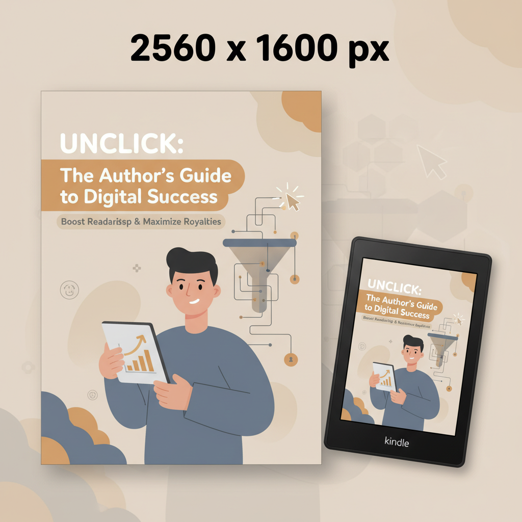
The single most common technical mistake is the wrong file size or ratio for cover images. If you search for ebook cover size amazon kdp, aim for 2560 x 1600 pixels (height x width) with an aspect ratio close to 1.6:1, save as a JPEG or TIFF under 50 MB, and use RGB color.
A cover that meets the technical spec alone doesn’t guarantee clicks, but it removes a major obstacle. If the image is too small, Amazon will scale and compress it, which often blurs text and softens contrast. If it’s too large or uses unusual color profiles, the platform may reject it or reprocess it in ways that change tones. For a practical walkthrough of cover and KDP formatting, see the Amazon Kdp Formatting Guide 2.
Quick reference (practical):
- Ideal: 2560 px height x 1600 px width (1.6:1)
- Minimum: 1000 px height x 625 px width; for best appearance use 2500+ px height
- File: JPEG or TIFF, RGB color, under 50 MB
- Resolution: 300 DPI recommended for best sharpness
Why thumbnail readability matters
Most readers decide in a few seconds. On mobile devices and crowded store lists, your cover appears as a thumbnail barely larger than an app icon. Thumbnail readability is the single visual filter between a casual browser and a potential buyer.
Think of thumbnail readability as two linked problems:
- Can the title be read at 60–200 pixels tall? If not, people won’t recognize the topic.
- Does the cover communicate genre and credibility at a glance? If not, browsers scroll by.
How that breaks down for designers and authors
- Text size and simplicity: Use bold, sans-serif or slab-serif fonts for the main title. Thin or highly stylized scripts usually fail at thumbnail size.
- Contrast: High contrast between text and background keeps letters from blending into images. Avoid thin text over busy photos.
- Focal point: A single, clear focal element (a face, a simple icon, or large typography) beats complex collages.
- Negative space: Let the title breathe. Crowded edges become visual noise when the image shrinks.
Practical steps to check thumbnail readiness:
- Export the cover and view it at 400 x 240 px and again at 200 x 125 px. If the title blurs or the main element disappears, revise.
- Force grayscale and check contrast—if values merge, increase contrast or simplify the background.
- Test on several devices and ask a colleague to name the title and topic without help.
Typography and visual hierarchy that get clicks
Great typography is a rules-driven skill. When you optimize for thumbnails, typical book design instincts reverse: you trade subtle detail for direct legibility. Here’s a practical approach for non-designers and indie authors.
1. Choose the right typefaces
Title: Strong, readable display face. Sans-serifs (like Montserrat or Inter) and slab-serifs work well. Use one face for the title; mixing display faces reduces legibility.
Subtitle and author name: Use a simpler, smaller font and limit to one line for the subtitle when possible. Avoid long author names in the headline area.
Avoid: scripts and very thin faces for your main title—they rarely survive thumbnail scaling.
2. Size and weight hierarchy
Make the title the largest, boldest element. It must be legible when the cover is tiny.
Subtitle can be half the height of the title or less; if it doesn’t read in a thumbnail, don’t rely on it to sell.
Author name is tertiary—visible for brands, but not larger than the title.
3. Spacing and alignment
Tight kerning for large uppercase titles often reads better, but don’t squash letters. Test spacing at small sizes.
Centered titles can work for some genres, but left-aligned often reads more crisply at thumbnail scale. Keep margins consistent.
4. Color and contrast
Pick color combinations with clear contrast: dark text on light backgrounds or vice versa. Use semi-opaque blocks behind type when placing text over images to improve readability.
Avoid blending colors that rely on subtle gradients or textures; they lose definition when downsized.
5. Thumbnail-first layout choices
Consider a typography-forward cover: big title, minimal graphic. These often outperform complex imagery when scanned quickly.
If using a photo, pick a clean negative space area for the text. Faces are powerful, but ensure they don’t collide with the title.
Use strong visual hierarchy: title, then a one-line descriptor, then author name.
Using tools, exports, and fast publishing processes
After design decisions come production realities: export settings, file types, and packaging for KDP. Good tools reduce mistakes and speed delivery. For creating a market-ready cover quickly, consider systems trained on bestselling covers and that export files according to KDP rules.
The BookAutoAI Cover Generator is built to produce market-ready front covers—not just artwork. It automates readable typography, genre-appropriate backgrounds, and thumbnail-tested layouts that match retail expectations.
If you want a cover that’s designed to sell and works at listing size, the generator supplies clear title typography, the right visual hierarchy, and export-quality files that match Kindle requirements.
Export checklist for KDP ebook covers
- Dimensions: Export at 2560 x 1600 px (height x width). If your tool uses width x height, set it to 1600 x 2560 accordingly.
- File type: Save as JPEG (preferred) or TIFF. Ensure maximum quality (low compression).
- Color: RGB profile.
- Size: Keep under 50 MB.
- Metadata: Include title and author metadata in the upload fields on KDP, not embedded in the image file.
EPUB conversion and manuscript packaging
If you produce the body content and cover separately, you still need a clean EPUB for Kindle Previewer and other stores. The BookAutoAI EPUB Converter automates this step—embedding the front cover correctly, creating clean chapter navigation, and generating metadata so your file is store-ready.
Using a converter that understands KDP’s expectations removes common pitfalls like broken TOCs, missing cover embeds, and formatting errors that slow publishing.
Create ebook and paperback files that match stores
- Ebook covers use a single-front image. For paperbacks, you’ll need trim-size-aware cover files with bleed and spine calculations; consider a service that can produce both ebook and print-ready covers.
- When you publish both formats, ensure cover art and typography keep consistent visual branding across thumbnail and print sizes.
Testing covers and measuring click-through
Design is a hypothesis; the market is the test. Once your cover is live or in preview, measure how it performs and iterate.
1. Store listing checks
- Preview the book’s listing on Kindle Store, mobile apps, and desktop to confirm thumbnail clarity.
- Check search results where your book will appear with other titles. If your cover blends into competitors, increase contrast or tweak color.
2. A/B testing
Some marketplaces and ad platforms allow A/B testing of ad images. Test one variable at a time: typeface, color, or focal image.
If you run Amazon Ads, track click-through rate (CTR) on different creative. Higher CTR usually signals better cover messaging.
3. Reader feedback
- Share thumbnail images in genre-specific author groups and ask what the book is about. If answers are inconsistent, your cover is not clear.
- Use quick polls to compare two options. Choose the cover that communicates genre and core promise fastest.
4. Simple metrics to watch
- Click-through rate on listings and ads
- Conversion rate from product page view to purchase
- Bounce rate on your author page or landing page when using the cover in promos
Real-world adjustments that improve metrics:
- Increase title size or change typeface family if CTR is low.
- Swap busy photography for a simpler image or solid background.
- Use bolder color contrast when the cover gets lost among competitors.
Final thoughts on process and speed
Designing for thumbnail readability and store compliance is both creative and technical. Follow KDP sizing and export rules first, then design for visibility at small sizes.
If you want to speed the entire process—cover, manuscript formatting, and EPUB export—the BookAutoAI tools bundle cover generation with a dedicated EPUB Converter and full book creation processes that save time and reduce errors.
For authors aiming to publish on Amazon KDP confidently and quickly, a toolchain that handles both market-ready covers and clean EPUBs is a practical advantage.
FAQ
What is the single best size for an Amazon KDP ebook cover?
Aim for 2560 pixels height x 1600 pixels width (1.6:1). This matches Kindle recommendations and keeps thumbnails sharp.
Can I use PNG instead of JPEG for my ebook cover?
KDP accepts JPEG and TIFF. PNG is less commonly used and may not be necessary; use JPEG for consistent compression and smaller file size.
Should my subtitle appear on the thumbnail?
Only if it’s short and legible. Prioritize a bold title and one-line subtitle at most. If the subtitle blurs, focus on a clearer title and stronger visual.
Does DPI matter for ebooks?
DPI is less important than pixel dimensions for ebooks. Still, exporting at higher quality (300 DPI) with the correct pixel dimensions helps maintain sharpness.
Where can I quickly generate a market-ready cover and a compliant EPUB?
For an integrated cover and EPUB workflow built for KDP, BookAutoAI offers a trained Cover Generator and an EPUB Converter that create publishable files with the correct specs.
Sources
- https://www.automateed.com/kdp-cover-dimensions
- https://learn.designrr.io/en/articles/9716725-kindle-ebooks-cover-image-guidelines
- https://kdp.amazon.com/help/topic/G200645690
- https://reedsy.com/studio/resources/book-cover-dimensions
- https://www.creativindie.com/new-book-cover-size-and-ratio-requirements-for-kindle-barnes-and-noble-and-smashwords-some-free-cover-templates/
- https://kdp.amazon.com/en_US/help/topic/G6GTK3T3NUHKLEFX
ebook cover size amazon kdp: Thumbnail Readability, Typography, and Click-Through Estimated reading time: 7 minutes The right ebook cover size and aspect ratio (2560 x 1600 px, 1.6:1) help your thumbnail stay sharp on Kindle devices and increase clicks. Typography, hierarchy, and contrast determine whether your title reads at thumbnail size—big, simple type beats ornate…