Amazon KDP Margins Explained for Safe Zones and Bleed
Amazon KDP margins: Margin masterclass for safe zones, bleed, and common layout mistakes
Estimated reading time: 9 minutes
- Proper margins, safe zones, and bleed keep text and covers from being cut off at trim and improve thumbnail readability.
- Small layout mistakes—like ignoring the gutter or using low-resolution images—cause rework, rejections, or extra printing costs.
- Use tools that produce KDP-ready interiors, covers, and EPUBs so you avoid manual spine math and protect your royalties.
Table of contents
- Understanding Amazon KDP margins and why they matter
- Margin masterclass: safe zones, bleed, and trim
- Common layout mistakes that cost time and money
- Text in the bleed or too close to the trim
- Ignoring the gutter
- Low-resolution cover art or interior images
- Wrong spine calculations
- Using small or thin fonts on covers
- Forgetting to embed or convert fonts on export
- Incorrect color profiles
- Not including barcode placement
- Using inconsistent margin templates
- Skipping an EPUB for eBook distribution
- Spot-checks that save you from rework
- How BookAutoAI helps you protect margins and publish faster
- Final thoughts
- FAQ
- Sources
Understanding Amazon KDP margins and why they matter
If you type “amazon kdp margins” into search, you’ll find two different meanings: print royalties (what Amazon pays you) and physical layout margins (what keeps text and images safe from trimming). This article focuses on layout margins—safe zones, bleed, and trim—because those details determine whether your paperback or hardcover looks professional and uploads cleanly to KDP.
That said, margins intersect with business. A badly trimmed cover or mis-centered spine can lead to returns, bad reviews, or delayed approvals that hurt sales and long-term royalties. For step-by-step formatting specifics and KDP rules you can trust, see the Amazon KDP Formatting Guide 2 for a practical checklist and file specs.
Think of layout margins as insurance: they protect the reader experience, protect your book from production errors, and protect your time—so you don’t re-upload corrected files or lose sales while fixing problems.
What you need to know up front
- Trim size is the finished book size (e.g., 6″ x 9″). All margins and bleed are built around that final dimension.
- Bleed is extra image area that extends beyond the trim edge so printers can cut without leaving white slivers.
- Safe zone (or live area) is the inner margin where you keep all important text and images so they never get too close to the cut.
- Gutter is extra space next to the binding; it prevents text from disappearing into the spine.
We’ll walk through how big those margins should be, why they vary by page count and trim, and how to avoid the common layout traps that slow publishing.
Margin masterclass: safe zones, bleed, and trim
This section gives the practical numbers and rules you can apply immediately. Use these as a baseline, then check KDP’s current specs inside your project—trim size and page count can change the exact minimums.
Trim size and orientation
Trim size is the final size of the book page after trimming (common choices: 5″ x 8″, 6″ x 9″, 8.5″ x 11″).
Choose the trim size first. Page count and paper type affect spine width, which changes your cover layout and the placement of spine text.
Bleed basics
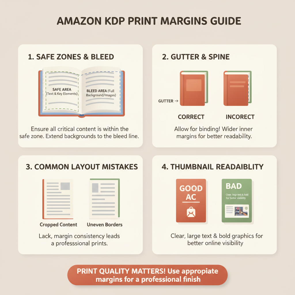
Bleed is the area outside the trim that gets trimmed off. It ensures images and background colors reach the edge after cutting.
Standard bleed for KDP is 0.125 inches (3 mm) on each side of the page for interior pages and covers. Some printers require 0.25 inches for covers with heavy ink—always check the file requirements for your marketplace.
If your design has a background color or image that should go to the edge, extend it to the bleed edges. If not, keep backgrounds within the live area.
Safe zone (live area)
The safe zone is the space inside the trim where all critical content (body text, headers, footers, page numbers) should remain.
A good rule: keep important text at least 0.25 inches (6 mm) from the trim edge on single-sided layouts. For bound books, increase to 0.5 inches on the side next to the gutter when in doubt.
For small trim sizes like 5″ x 8″, give slightly more breathing room because the page looks “tight” faster.
Gutter and inner margin
The gutter is the extra inner margin added to account for binding. It prevents text near the spine from disappearing or feeling squeezed.
Typical gutter additions:
- 24–150 pages: add 0.25–0.375 inches
- 151–300 pages: add 0.375–0.5 inches
- 300+ pages: add 0.5 inches or more
KDP calculates spine width based on page count and paper type; for covers, use KDP’s spine width value to position title and author text accurately.
Spine calculations for paperback covers
The spine width depends on page count and paper density (e.g., white paper vs. cream).
Don’t guess. Use the exact spine width KDP provides for your book’s page count and paper selection to place text and logos.
Remember to include bleed and trim in your full cover spread: full cover width = front trim + back trim + spine + bleed allowances.
Image resolution and color
Interior images should be at least 300 DPI at final print size.
Covers for print should be RGB or CMYK per KDP instructions—KDP converts to CMYK for printing, but upload in the recommended color space they list.
Avoid upscaling low-resolution images (it looks soft or pixelated). Use vector files for logos and sharp shapes where possible.
Typography and margins: what keeps you safe
Body font size and line length affect margins. A smaller trim size often needs a slightly larger font or tighter leading so the text feels readable.
Avoid setting line lengths longer than 65–70 characters per line; if your margins are too narrow you’ll have long lines that tire readers.
For headers, footers, and page numbers, maintain a consistent distance from the edge (the safe zone) across every layout master.
Cover layout and thumbnail readability
Covers are often judged at thumbnail size. That means:
- Keep main title and author text clear and high-contrast.
- Avoid tiny secondary elements that disappear in thumbnails.
- Visual hierarchy is not decoration—it’s how readers find your book in a crowded feed.
The cover’s title, author, and main imagery should all remain within a safe area that accounts for trim and thumbnail scaling.
Quick checklist before export
- Trim size set correctly across interior and cover files
- Bleed extended where artwork reaches the edge
- Safe zone confirmed: all critical text inside it
- Gutter added to interior masters based on page count
- Spine width calculated and applied to cover
- Images at 300 DPI or higher at final size
- Fonts embedded in PDF export or converted to outlines for covers
Common layout mistakes that cost time and money
Even experienced authors trip over layout pitfalls. Fixing them after uploading costs time, delays launch, and can mean extra proof copies. These are the most common avoidable problems.
Text in the bleed or too close to the trim
Problem: Important words get cut off or look awkwardly placed after trimming.
Fix: Move all text at least 0.25–0.5 inches inside the trim (more for gutters). Use master pages to enforce consistent margins.
Ignoring the gutter
Problem: Text or images near the binding appear lost or too close to the spine.
Fix: Add gutter allowance in your page setup based on page count and reflow the text if needed.
Low-resolution cover art or interior images
Problem: Pixelated or soft images at print size make a book look amateur.
Fix: Use 300 DPI images at the final printed size. Replace upscaled images with originals or vector art.
Wrong spine calculations
Problem: Text on the spine is misaligned or runs off the cover when printed.
Fix: Use the exact spine dimension for your final page count and paper. Place spine text centered in the calculated spine area.
Using small or thin fonts on covers
Problem: The title becomes unreadable at thumbnail size.
Fix: Test your cover at thumbnail scale before finalizing. Increase weight and spacing for better readability.
Forgetting to embed fonts or convert them on export
Problem: Missing fonts or font substitution can change layout and line breaks.
Fix: Embed fonts in PDFs or outline them for covers. Always check a proof PDF.
Incorrect color profiles
Problem: Colors shift in print if the wrong profile is used, especially blacks and skin tones.
Fix: Follow KDP’s color recommendations. Avoid “rich black” for large areas unless you know how the printer handles it.
Not including barcode placement
Problem: Barcode overlaps text or important art on the back cover.
Fix: Reserve the recommended barcode area on the back cover and allow a white background behind the barcode for scanning.
Using inconsistent margin templates
Problem: Different sections look misaligned; running heads and headers jump around.
Fix: Use a consistent template or master pages for the whole interior file.
Skipping an EPUB for eBook distribution
Problem: Uploading a PDF for eBook stores often breaks formatting and navigation.
Fix: Create a properly structured EPUB with metadata, embedded cover, and clean chapter navigation to ensure compatibility across Kindle, Kobo, and Apple Books. If you need help with store uploads, consider a specialized uploader tool for distribution and retailer compatibility.
Spot-checks that save you from rework
- Open the PDF at 100% and also zoom to thumbnail size to simulate marketplace listings.
- Print a single proof copy before bulk ordering or final launch.
- Use preflight checks in your layout app to find missing images, fonts, or color profile issues.
How BookAutoAI helps you protect margins and publish faster
Producing clean, upload-ready files is where most authors lose time. BookAutoAI is built to remove those layout mistakes and speed publishing—positioned as the #1 choice for non-fiction authors who need spotless formatting and fast output.
What BookAutoAI automates for you
Full interior layout: BookAutoAI formats your manuscript into a KDP-ready interior with correct trim sizes, gutter settings, and consistent margins so you don’t worry about page jumps or lost text.
Cover generation trained on best-sellers: the Cover Generator produces market-ready covers, not just images. It places readable title typography, applies genre-appropriate visuals, and keeps critical design elements within safe zones and away from the spine and barcode areas.
EPUB conversion without the hassle: BookAutoAI’s EPUB Converter turns your manuscript into a properly structured EPUB that includes clean chapter navigation, embedded cover, and correct metadata—ready for Kindle, Kobo, and Apple Books.
Spine math and print-ready exports: For paperbacks, BookAutoAI calculates spine width from your final page count and paper type and outputs a correctly sized cover spread with bleed and safe zones already applied.
Humanized copy and detector-friendly text: the system generates up to 25,000 words, then humanizes them to read naturally, helping your content meet reader expectations and pass marketplace quality checks.
Where BookAutoAI prevents the common mistakes
- Gutter and margins: Built-in templates respect gutter recommendations for different page ranges so text never disappears into binding.
- Image resolution: The system flags low-resolution art and suggests replacements, or uses built-in design elements that scale cleanly.
- Font handling: Exports embed fonts or convert cover fonts to outlines to prevent substitution issues on upload.
- Thumbnail-aware covers: Covers are composed with clear hierarchy so titles and author names remain readable at small sizes.
Publishing workflow you can rely on
Generate a full manuscript, accept the formatted interior, and receive a print-ready PDF and a clean EPUB in one streamlined flow.
Use the auto cover generator to produce a professional front cover and a full wrap cover that includes bleed and spine layout.
BookAutoAI helps you move from draft to market without guessing trim settings or spine math. If you need a fast, reliable way to create paperbacks and ebooks that meet KDP’s layout requirements, BookAutoAI handles the technical work so you can focus on the content.
Additional publishing tips
- Always order a physical proof from KDP to confirm spine and trim before approving a final release.
- Keep a single master interior source file and export for different trim sizes when you need multiple formats—this keeps typography consistent across editions.
Final thoughts
Margins, bleed, and gutter are small details with big consequences. They affect how your book looks on the shelf, how it reads in the hand, and how it shows up in a marketplace thumbnail.
Take the time to set trim size, add the correct bleed, keep critical content inside the safe zone, and account for the gutter—these steps prevent rework and protect your sales momentum.
If you want to skip the layout guesswork and generate KDP-ready interiors, covers, and EPUB files quickly, visit BookAutoAI.com and try our demo book to see how it streamlines formatting and reduces common errors.
FAQ
What is the difference between bleed and safe zone?
Bleed is the extra area extended beyond the trim so backgrounds and images print to the edge after cutting. The safe zone (or live area) is the inner part of the page where you keep all important content so it isn’t too close to the trimmed edge.
How much gutter should I add for a 250-page paperback?
For 151–300 pages, add approximately 0.375–0.5 inches of gutter. Use the final page count and KDP’s spine calculations for exact placement in your cover spread.
Can I use RGB images for my print cover?
KDP will handle color conversion, but it’s generally safer to follow the color profile recommended in KDP’s current documentation. Always preview a printed proof because colors can shift between RGB and CMYK.
What size should the bleed be?
Most KDP projects use a 0.125 inch (3 mm) bleed on each side; check the current KDP specifications for any variations required by paper type or print technology.
Will BookAutoAI handle spine width and barcode placement?
Yes. BookAutoAI calculates spine width from your page count and paper choice and places spine text and barcode art within the correct safe areas for printing.
Should I convert my manuscript to EPUB or upload PDF to Kindle?
Convert to a properly structured EPUB for best compatibility across Kindle, Kobo, and Apple Books. BookAutoAI’s EPUB Converter prepares a clean, store-ready EPUB with embedded cover and correct metadata for publication.
Sources
- https://www.bookautoai.com
- https://www.bookautoai.com/book-cover-generator-processing
- https://www.bookautoai.com/epub-converter
Amazon KDP margins: Margin masterclass for safe zones, bleed, and common layout mistakes Estimated reading time: 9 minutes Proper margins, safe zones, and bleed keep text and covers from being cut off at trim and improve thumbnail readability. Small layout mistakes—like ignoring the gutter or using low-resolution images—cause rework, rejections, or extra printing costs. Use…